You can customize the styles of your Supercharged forms from Supercharge Settings page. We have included an extensive theming system, that allows you to create themes with a single click and use them on multiple forms at once. If you do not wish to use themes, simply make changes to the Default theme. Those are the default styles for all forms, unless you change them.
You can find these settings in your WordPress dashboard menu for Gravity Forms. Under Forms > Settings > Supercharge. Or use the shortcut added in Form Settings (besides theme selection drop down.)
Before you make changes, select the theme you want to customize.
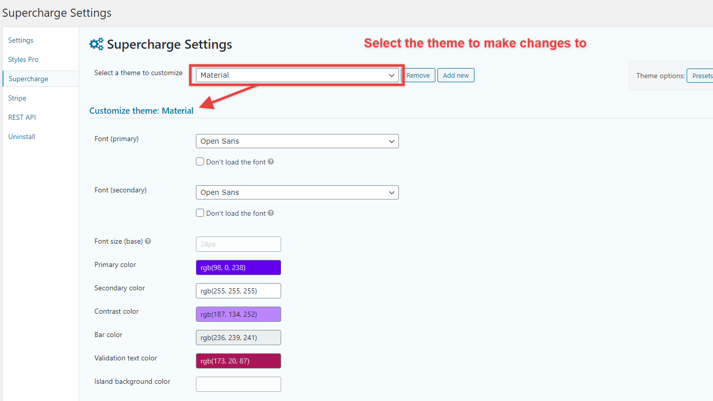
The purpose of adding Default colors to customize the themes is to significantly reduce the time to spread your chosen colors across your theme with different options. You can choose the Primary, Secondary, Contrast (to secondary) and the Bar color only, and your theme should adapt. You can also choose 2 fonts that you want use throughout the theme. Furthermore, you will also see how these colors spread out in your theme’s style options, and you can swap any color with the other or a custom color of your choosing for any given option. For the most part, these options should take care of most of the design, you can play around with these to find your look then start to fine tune your theme using the advanced options below.
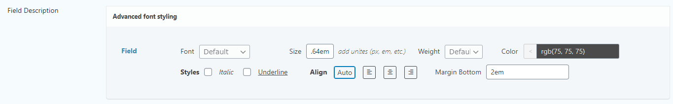
In the Theme Customization options, you’re able to set styles in details field labels, description and fields themselves. You do not have to set all the options, but if you want you can drill down into specifics, for example, you might want to distinguish, size, color and font of the description and align it to the center. Similar options can be revealed for labels as well. The buttons and input fields contain more options.
Default Color Presets
Primary color:
- Base color (elements that aren’t applied a color will inherit this)
- Label
- Description
- Splash heading
- Section heading
- Input Text
The secondary color is mostly used to highlight the choices, percentage bar and buttons.
Percentage bar
- Background: (45% Primary color)
- Border: Secondary color
- Completion bar: Primary color
- Percentage text: Secondary color
- Percentage text (Medium progress bar option): Primary color
Choices
The colors for the choices (radio/checkbox etc) are adapted colors. They are also based on the base colors. Here’s a breakdown:
- Border (10% of Primary color)
- Background (5% of Primary color)
When Checked:
- Background (Primary color)
- Text (Secondary color)
Buttons
- Background: Primary color
- Text: Secondary color
- Border: Secondary color
Focused:
- Background: Secondary color
- Text: Contrast color
- Border: Contrast color
Buttons in Strips
- Text: Contrast color
- Background: None
Focused:
- Text: Contrast color
Rating field
- Unchecked: Secondary color
- Checked: Primary color
Customizing Button Styles
Read more about the included button designer here.