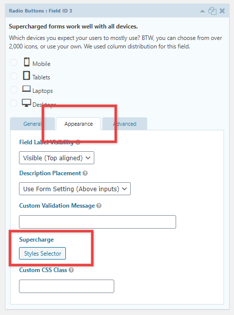
Using the Style Selector, you can display your options in a number of different ways.
Columns
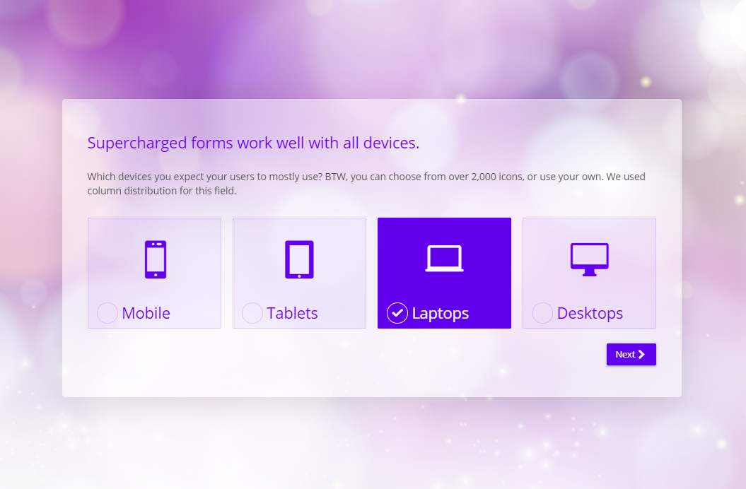
Column options can be especially useful when using icons or images in your choices. You can save a lot of space and, better the user experience by displaying your options in columns. You can choose from 1 to 6 columns, or use automatic (based on the width of the text and/or image of the option. The fields automatically adjust for smaller screens, for example, 6 columns turn into 3 on medium sized screens and into 2 on smaller screen. Likewise, 3 columns turn into 2 on medium sized screens and 1 on very small screens. If you want to keep the columns on smaller screens you can use the Ignore Screen Breakpoint options.
Styles
There are 7 different styles you can choose. Furthermore, you can also display the options in a column-like look.
Note, that all the styles are compatible with fields with text alone, or added icons or images.
Image/icon settings
You can use these options to fine-tune the ornaments in your options. The options here allow swapping the position between text and image and adjusting the size of the ornament in the container.